라이브러리 없이 재사용 가능한 컴포넌트 만들기 (feat. Web Components)


웹 컴포넌트를 만드는 3가지 표준이 있습니다 :
- HTML 템플릿 (<template>)
- 사용자 정의 요소
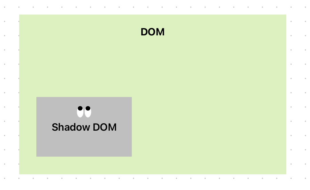
- Shadow DOM
이들을 조합하면 재사용 가능하고 캡슐화 된 컴포넌트를 만들 수 있어요. (React 없이도!)

웹 컴포넌트를 이용해서 위와 같은 rating컴포넌트를 만들어보겠습니다.
<star-rating> 웹 컴포넌트 만들기
1. template 제작
컴포넌트를 만들때 <template>요소를 사용합니다
- <template> 요소는 DOM에 미리 정의해놓는 HTML 조각입니다.
- html상 존재하더라도 기본적으로 화면에 표시되지는 않습니다.
- 화면에 표시되게 하려면 JS로 DOM에 삽입해줘야 합니다.
- 클론 및 삽입할 수 있는 HTML 구조를 선언할 때 사용합니다.
일단 기본 템플릿 먼저 만들어봅시다.
HTML코드와 CSS를 아래와 같이 짜봅시다.
<template id="star-rating-template">
  <form>
    <fieldset>
      <legend>Rate your experience:</legend>
      <rating>
        <input type="radio" name="rating" value="1" aria-label="1 star" required />
        <input type="radio" name="rating" value="2" aria-label="2 stars" />
        <input type="radio" name="rating" value="3" aria-label="3 stars" />
        <input type="radio" name="rating" value="4" aria-label="4 stars" />
        <input type="radio" name="rating" value="5" aria-label="5 stars" />
      </rating>
    </fieldset>
    <button type="reset">Reset</button>
    <button type="submit">Submit</button>
  </form>
</template>
rating {
display: inline-flex;
}
/* make the current radio visually hidden */
input[type=radio]{
appearance: none;
margin: 0;
box-shadow: none; /* remove shadow on invalid submit */
}
/* generated content is supported on input. */
input[type=radio]::after {
content: '\2605';
font-size: 32px;
}
/* by default, if no value is selected, all stars are grey */
input[type=radio]:invalid::after {
color: #ddd;
}
/* if the rating has focus or is hovered, make all stars darker */
rating:hover input[type=radio]:invalid::after,
rating:focus-within input[type=radio]:invalid::after
{color: #888;}
/* make all the stars after the focused one light grey, until a value is selected */
rating:hover input[type=radio]:hover ~ input[type=radio]:invalid::after,
rating input[type=radio]:focus ~ input[type=radio]:invalid::after {color: #ddd;}
/* if a value is selected, make them all selected */
rating input[type=radio]:valid {
color: orange;
}
/* then make the ones coming after the selected value look inactive */
rating input[type=radio]:checked ~ input[type=radio]:not(:checked)::after{
color: #ccc;
content: '\2606'; /* optional. hollow star */
}
여기까지 코드를 입력해도 화면에 아무것도 렌더링되지 않습니다.
<form>은 <template>요소 안에 있기 때문입니다.
브라우저 콘솔이나 개발자 도구에서 HTML 소스 탭을 보면 <template> 안의 마크업이 존재하는걸 확인할 수 있습니다.
이를 화면에 보이게 하려면 아래와 같이 JS로 DOM에 삽입해야 합니다.
let starRating = document.getElementById("star-rating-template").content;
document.body.appendChild(starRating);
이제 화면에 <form>이 렌더링 되는 것이 보이시죠?

💡 good to know
- <template>의 내용은 DocumentFragment 객체로 감싸져 있으며
- JS에서 document.getElementById('star-rating-template').content로 접근 가능
- 해당 fragment를 클론하여 원하는 DOM에 append하면 화면에 나타남
2. <slot>요소를 사용해 동적인 컨텐츠를 넣을 수 있도록 만들기
웹컴포넌트는 재사용 가능한 일종의 템플릿 박스인데요,
박스 안의 어떤 부분은 사용자가 넣는 내용으로 바뀌어야 하겠지요.
이때 HTML이 제공하는 "구멍"이 바로 <slot>입니다. 리액트로 따지자면 props라고 할 수 있죠.
우리는 "Rate your experience:" 텍스트를
원하는 텍스트를 삽입할 수 있도록 <slot>을 사용하여 수정할 겁니다.
<legend> → <slot> 으로 교체
<!-- 변경 전 -->
<template id="star-rating-template">
	...
      <legend>Rate your experience:</legend>
    ...
</template>


<!-- 변경 후 -->
<template id="star-rating-template">
	...
      <slot name="star-rating-legend">
        <legend>Rate your experience:</legend>
      </slot>
    ...
</template>
<slot> 요소에 name="star-rating-legend" 라는 값이 들어가있습니다.
이 값을 어떻게 쓰는지는 밑에서 계속 설명드리겠습니다.
3. 요소를 커스텀 요소로 "등록"해주기
지금까지는 <template>안에 사용한 <ratings>요소는 커스텀 요소가 아닌
단지 미정의된 HTML요소입니다. (undefined elements)
body에 append해줬기 때문에 화면에 보이긴 하지만 사실 이런 상태로는
웹 컴포넌트를 재사용 할 수 없기 때문에 의미가 없습니다.
<template>을 복사해서 Shadow DOM 안에 넣어주는 Custom Element를 만들면 재사용이 가능해집니다.
커스텀 요소로 정의하기
JS코드를 수정해보겠습니다.
기존에 작성한 코드를 모두 지우고 아래 코드를 작성해줍시다.
customElements.define('star-rating', //이름 컨벤션 반드시 지키기
  class extends HTMLElement {
    constructor() {
      // 반드시 super() 먼저 호출
      super();

      // template요소의 content찾기
      const starRating = document.getElementById('star-rating-template').content;


      // Shadow DOM 생성
      const shadowRoot = this.attachShadow({ mode: 'open' });
      // Shadow DOM에 붙이기
      shadowRoot.appendChild(starRating.cloneNode(true));
    }
  });
customElements.define함수의 첫번째 인자로 커스텀 요소의 이름을 넣어줍니다.
💡 good to know
웹 컴포넌트를 만들 때 네이밍 규칙이 있다 :
- 이름은 모두 소문자로 작성
- 반드시 하이픈(-)을 포함해야 함 -> 일반 HTML요소와 구분하기 위함
✔ 유효한 이름 : my-element, star-rating, app-button
❌ 유효하지 않은 이름 : button, rating, modal
4. HTML에서 재사용하기
이제 어디서도 <star-rating>을 쓸 수 있습니다.
<slot>에 들어갈 콘텐츠도 넣을 수 있습니다.
아래처럼 우리가 정의한 컴포넌트를 사용하는 코드를 작성해봅시다.
<star-rating>
    <legend slot="star-rating-legend">
    	오늘의 맛은 어떠셨나요?
    </legend>
</star-rating>
slot 프로퍼티의 값을 <template>안의 <slot>태그의 name에 넣었던 값과 동일하게 넣어줍니다.
( ex : name="star-rating-legend")

만약 slot을 생략하고 아래와 같이 사용할 경우
<template>에 넣어둔 기본 값이 들어가게 됩니다.
<star-rating></star-rating>
그런데 우리가 열심히 줬던 스타일이 리셋되었습니다. 왜그럴까요?
이 컴포넌트들은 Shadow DOM에 append된 요소들입니다.
섀도우 돔은 자기만의 독립된 HTML세계라서
밖에서 만든 CSS는 섀도우 돔 안으로 들어갈 수 없습니다.
섀도우 돔 안의 요소들도 바깥의 CSS를 보지 못합니다.
때문에 Shadow DOM내부에 직접 스타일을 넣어줘야 합니다.
5. Shadow DOM안에 스타일 추가하기
방법은 여러가지가 있습니다.
1. JS로 추가하기
템플릿 스트링 문법으로 css를 작성해서 섀도우 돔에 append해주는 방법입니다.
보시다시피 보기에 좋진 않습니다.
customElements.define('star-rating',
  class extends HTMLElement {
    constructor() {
      super();
      const starRating = document.getElementById('star-rating-template').content;

      const shadowRoot = this.attachShadow({ mode: 'open' });
      shadowRoot.appendChild(starRating.cloneNode(true));

      const style = document.createElement('style');
      style.textContent = `
            rating {
              display: inline-flex;
            }

            input[type=radio]{
              appearance: none;
              margin: 0;
              box-shadow: none;
            }

            input[type=radio]::after {
              content: '\\2605';
              font-size: 32px;
            }
            ...
            `
      shadowRoot.appendChild(style);
    }
  });
2. <template>내에서 스타일 태그로 추가하기
저는 이 방법이 괜찮아 보이네요!
 <template id="star-rating-template">
   <style>
     rating {
       display: inline-flex;
     }
    input {
      appearance: none;
      margin: 0;
      box-shadow: none;
    }
    input::after {
      content: '\2605';
      font-size: 32px;
    }
    rating:hover input:invalid::after,
    rating:focus-within input:invalid::after {
      color: #888;
    }
    input:invalid::after,
    rating:hover input:hover ~ input:invalid::after,
    input:focus ~ input:invalid::after  {
      color: #ddd;
     }
    input:valid {
      color: orange;
    }
    input:checked ~ input:not(:checked)::after {
      color: #ccc;
      content: '\2606'; /* optional. hollow star */
    }
   </style>
   <form>
  <fieldset>
    <slot name="star-rating-legend"><legend>Rate your experience:</legend></slot>
     <rating>
       <input type="radio" name="rating" value="1" aria-label="1 star" required/>
       <input type="radio" name="rating" value="2" aria-label="2 stars"/>
       <input type="radio" name="rating" value="3" aria-label="3 stars"/>
       <input type="radio" name="rating" value="4" aria-label="4 stars"/>
       <input type="radio" name="rating" value="5" aria-label="5 stars"/>
     </rating>
    </fieldset>
     <button type="reset">Reset</button>
     <button type="submit">Submit</button>
</form>
</template>

<star-rating>
  <legend slot="star-rating-legend">오늘의 식사는 어떠셨나요? :</legend>
</star-rating>
💡 good to know
섀도우 돔 안에 있는 것들은 철벽처럼 외부 스타일이 절대 못 건드리는 영역이다.
그런데 slot으로 들어오는 콘텐츠에는 예외가 있다.
- Shadow DOM = 방
- slot = 방에 달린 창문
slot에 연결된 콘텐츠는 외부 콘텐츠이므로 바깥 css의 영향을 받으며,
섀도우 돔 안의 css 영향을 받지 않는다.
위 예제에서는 <legend>태그에 스타일을 주려면 외부 css에 작성해줘야 함.
이제 다시 스타일이 돌아왔습니다.

3. 전역 CSS에서 Shadow DOM 내부 스타일링하기
방금 외부 css는 섀도우 돔에 영향을 주지 못한다고 했는데
사실 방법이 하나 있습니다. part 속성을 이용하는겁니다.
먼저 템플릿 내부 요소에 part속성을 추가해봅시다.
<template id="star-rating-template">
  <form part="formPart">
    <fieldset part="fieldsetPart">
      ...
이제 전역 css에 아래 코드를 작성해봅시다.
star-rating::part(formPart) {
  padding: 1rem;
  border: 1px solid #ccc;
  background: #ccc;
}

star-rating::part(fieldsetPart) {
  border: 1px solid #ccc;
  background: #ffffff;
}
part는 class처럼 동작합니다. 아래에 스타일이 잘 들어간 것을 볼 수 있습니다.

참고한 자료
https://web.dev/learn/html/template?hl=ko
템플릿, 슬롯, 섀도우 | web.dev
'템플릿, 슬롯 및 그림자에 대한 설명입니다.'
web.dev
'프론트엔드' 카테고리의 다른 글
| JS로 애니메이션 삼국지 통일 (WAAPI : Web Animation API ) (0) | 2025.12.10 |
|---|---|
| 유튜브는 왜 리액트를 쓰지 않았을까? — Web Components (1) | 2025.11.19 |
| 생각지도 못한 <picture>태그의 활용 (0) | 2025.09.22 |
| 최대한 효율적인 이미지 로딩을 목표로 브라우저 일시키기 (0) | 2025.09.15 |
| 논리 픽셀, 물리 픽셀이 뭔지 아시나요? DPR 제대로 이해하기 (0) | 2025.08.20 |